Design System for Food Delivery App

Introduction
Being creative while designing a product and building a set of rules around it, while having a developers mindset, is probably the reason why I do product design.
In this case study I'll discuss how and why I created a design system for a food delivery app. I will explain the reason for this project, the problems before and future, the design principles, methodologies, and tools that I used.
Problem
The previous design system was hastily developed in a fast-paced startup setting, likely evolving alongside product development. As a result, it has numerous issues, with the most significant being inconsistencies throughout the design system, which affects the experience of all Fudy's products. This is causing a lot of challenges for product designers tasked with creating new features, as well as for developers relying on the design system to build their components.
A design system should serve as a single source of truth, that will help optimize design efficiency and avoid mistakes.
Decision
Upon joining the company, I started to work on the design system. I quickly realized though, that it would be more difficult and time-consuming for me to try to salvage the existing system, rather than build a new system from the zero, using the best design practises available. This allowed me to work more efficiency, by incorporating Figma's new features like variables and modes, and setting up the design system according to Atomic and Modular Design principles.
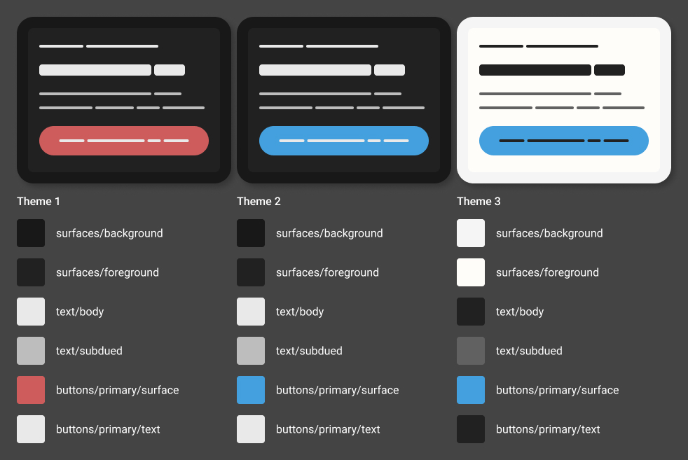
Using semantic tokens to create themes
Variables and Tokens
Tokens are the DNA of the design system, a single source of truth. The previous design system that was built was confusing to designers and developers. Android, iOS, and web developers all had their own understandings and implementations, leading to inconsistencies across the platform. With the new design system, we needed an approach that would solve all these inconsistencies while also allowing us to scale.
Figma has launched Variables, which can support complex token structures. They can be used to define other variables besides colors, and they also support modes for theming, of which we have already taken advantage.
In Fudy's previous design system, colors were defined as Styles, so the first thing was to migrate all those to variables, except for gradients, which are not yet supported in variables.
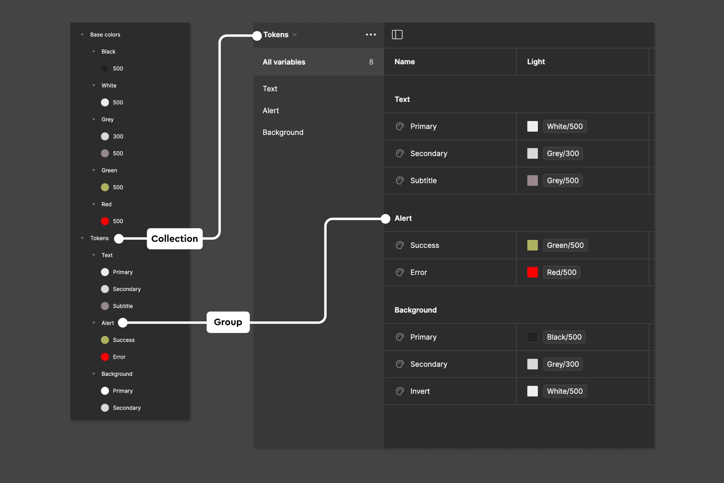
Migrating styles to variable tabels
I created a variable collection for base colors (or primitives) and migrated all the color values from the Styles to the variable collection. I organized each color variable by its base color—black, white, green, red, blue, etc.—and created a color ramp based on Material Design. Since we have themes in our design library, I created a few tertiary colors by mixing a neutral primary color with a brand primary color.
Initially, I created variables for numbers as well, to use them for radii and paddings. But I dropped the approach later since it added an unnecessary layer of complexity for the product that didn't need it.

Selection of primitives based on Google Material
The next step was creating tokens. I took the semantic approach because I name them by their actual purpose, to show how and where the colors are used. I created another collection for that. I identified in which areas the colors will be used and grouped the tokens by their matching purpose: surfaces, buttons, texts, icons, cards, labels, forms, alerts, etc. Within each group, I further grouped tokens by their exact usage, for example:
It's better to have more groups rather than trying to make the system minimal. It will help us be more flexible in the future and offer more customization for future theming.
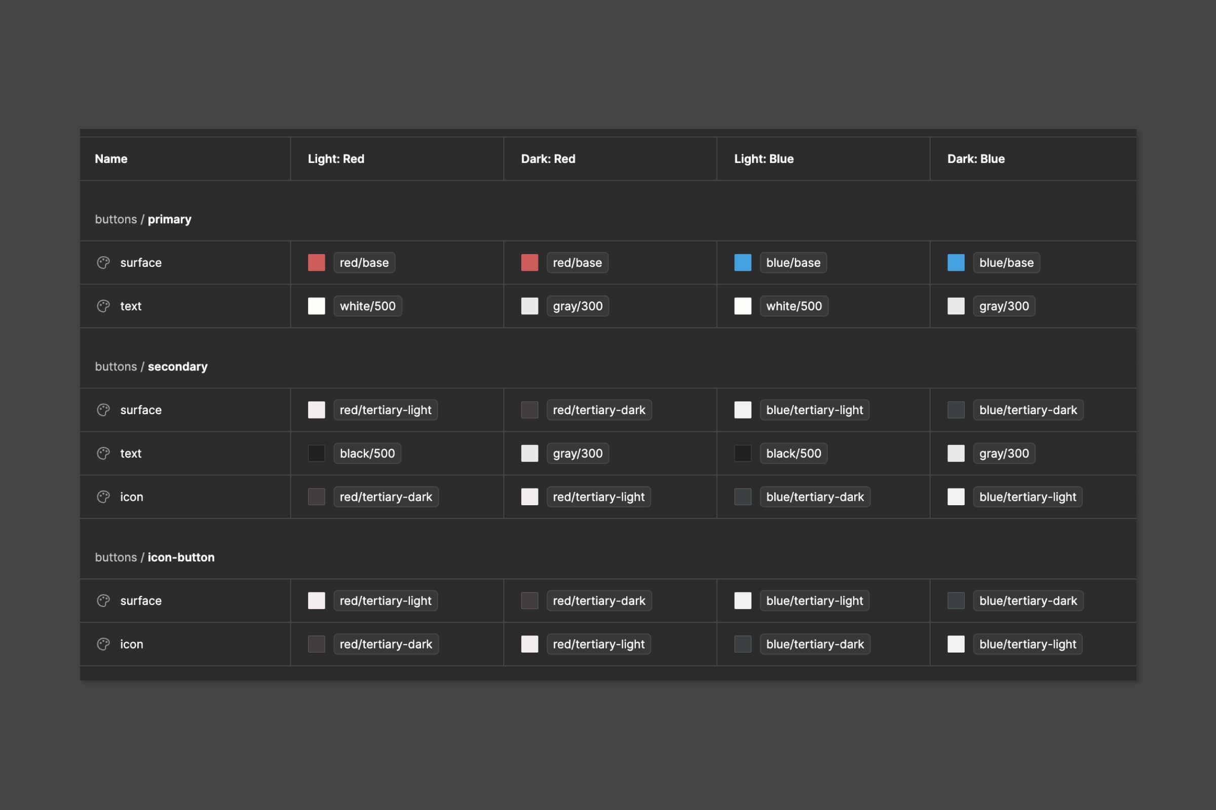
Tokens in the tabel
Atomic Design
I've adopted the Atomic Design methodology to construct components, an approach that dissects UI elements into smaller, reusable, and flexible components. On the Atomic level, I defined text styles, icons, and elevations, while colors found their definition in Variables. These fundamental building blocks, or Atoms, were then seamlessly combined into molecules through nested components and instances. For instance, a button—essentially a rectangle (a molecule)—is paired with text and an icon (both acting as molecules). This end the design possibilities for this rectangle, transforming it into a molecule.
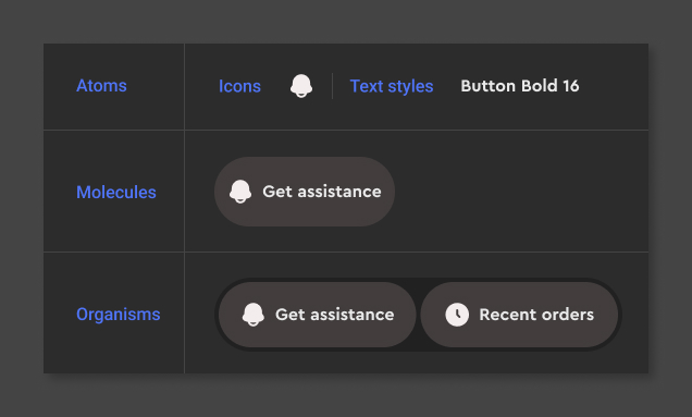
Atomic Design
Multiple molecules make an organism. For instance, two buttons nested within an auto-layout container form an organism. What makes this organism particularly intriguing is its flexibility. The icons and text within the molecules can be easily swapped out through instances, allowing for dynamic variations. Furthermore, this adaptable organism can effortlessly accommodate different themes, adding an extra layer of versatility to our design system.
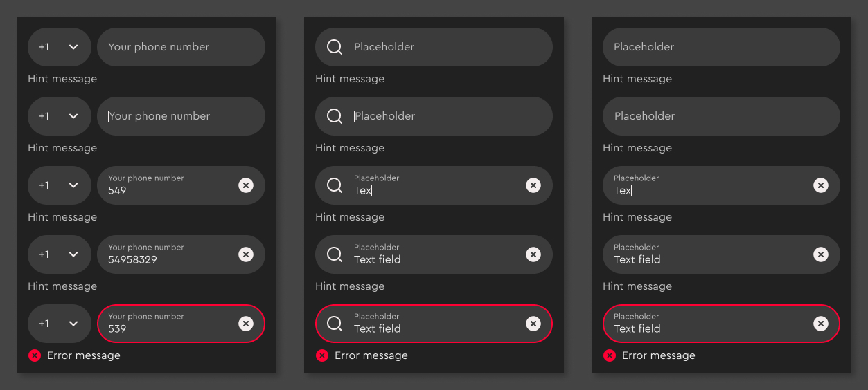
Forms in different states
Modular design
I've taken the approach of a modular design, which is about breaking down a design into smaller parts. Each module serves a specific functions or displays specific content, and these modules can be combined and reused across different parts of the UI. Meanwhile most of the modules contain nested instances (molecules, atoms), which can be swapped out, giving the design system even more flexibility. I think the greatest advantage of modular design is reusability and maintainability.

Modular design principles
Impact
New design system is set up following the best design practises, while also using Figma's latest features, like auto-layout, variables, modes and advanced prototyping. This will allow product designers to rely on this system and trust it as a single source of truth. Furthermore it will make developer's work easier and more efficient due to bridging the gap between the design and development. Overall it will make entire product development more efficient and transparent.
Conclusion
I recently came upon an article by Josh Clark who introduced me the principle of Pace Layers, which states that successful design systems move more slowly than the products they support. Product is a fast layer, which innovates and Design System is a slow layer, which stabilizes. When that design system is poorly developed, it will slow the product layer
I find myself really resonating with this statement and I've experienced first-hand, what will happen with the design system and the product itself, when the design system is rushed.
The timing of this project has been perfect for me, since I got to learn new software features while I was building a design system. I collaborated with developers, took into account their perspectives and hopes and I believe the result is something to be proud of. Looking ahead, our focus is on continous refinement and expansion of the design library, slowly scaling it behind the product development.