Tempus

Introduction
I teamed up with my friend Olaf as a co-product designer on this project of 3 separate products at Tempus, where Olaf held the lead product designer role. Together, we tackled three distinct Web3 projects named Nostra, WenWin and Raft. Although all DeFi products, each had its own uniqueness. The experience of working on these projects was both challenging and fascinating. Designing for the uncharted territories of Web3, known for its playful nature, has been a significant milestone in my design career.
Overview
Tempus is a hub for builders, creators, and connectors shaping the future of DeFi. Fueled by world-class product development and a touch of humor through memes, Tempus embodies innovation. Personally intrigued by FinTech and the potential of Web3, I was already following key players in the space. Connecting with Olaf through social media, a seasoned product designer in the Web3 world, revealed a unique synergy. Our collaboration was effective and enjoyable, as we both brought valuable skills to the table.

Brands I worked on
Nostra
Nostra is a decentralized exchange, where it's possible to lend, borrow, and trade crypto.
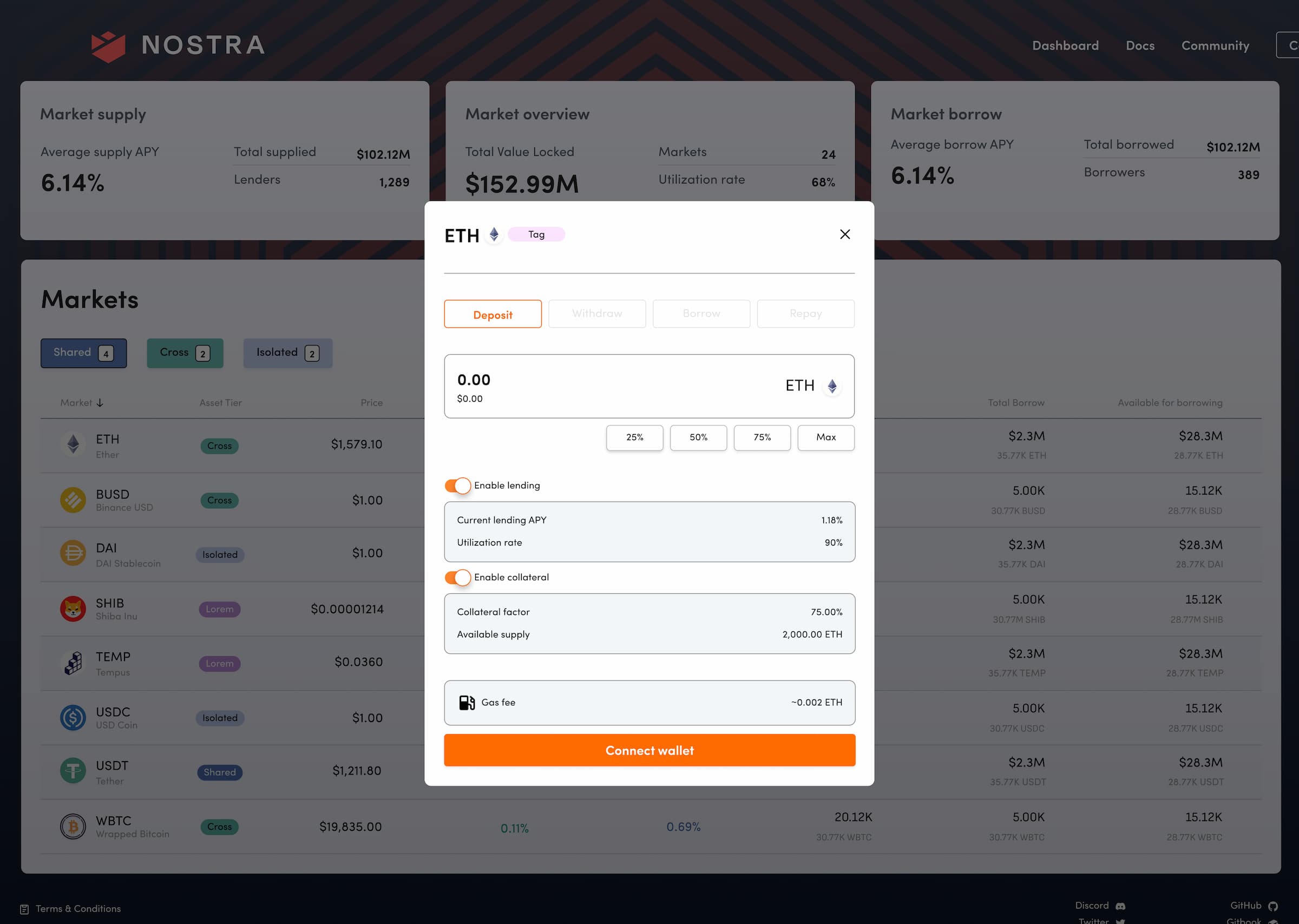
Exchange dashboard
This was the first product in the series of three, in which I was involved. Olaf already had set up the main framework with the initial design system, but there were still a lot of interactions and components that needed attention. Alongside numerous small tasks I mostly contributed in UX design for various interactions in between user-tasks and UI design of components and their various states.
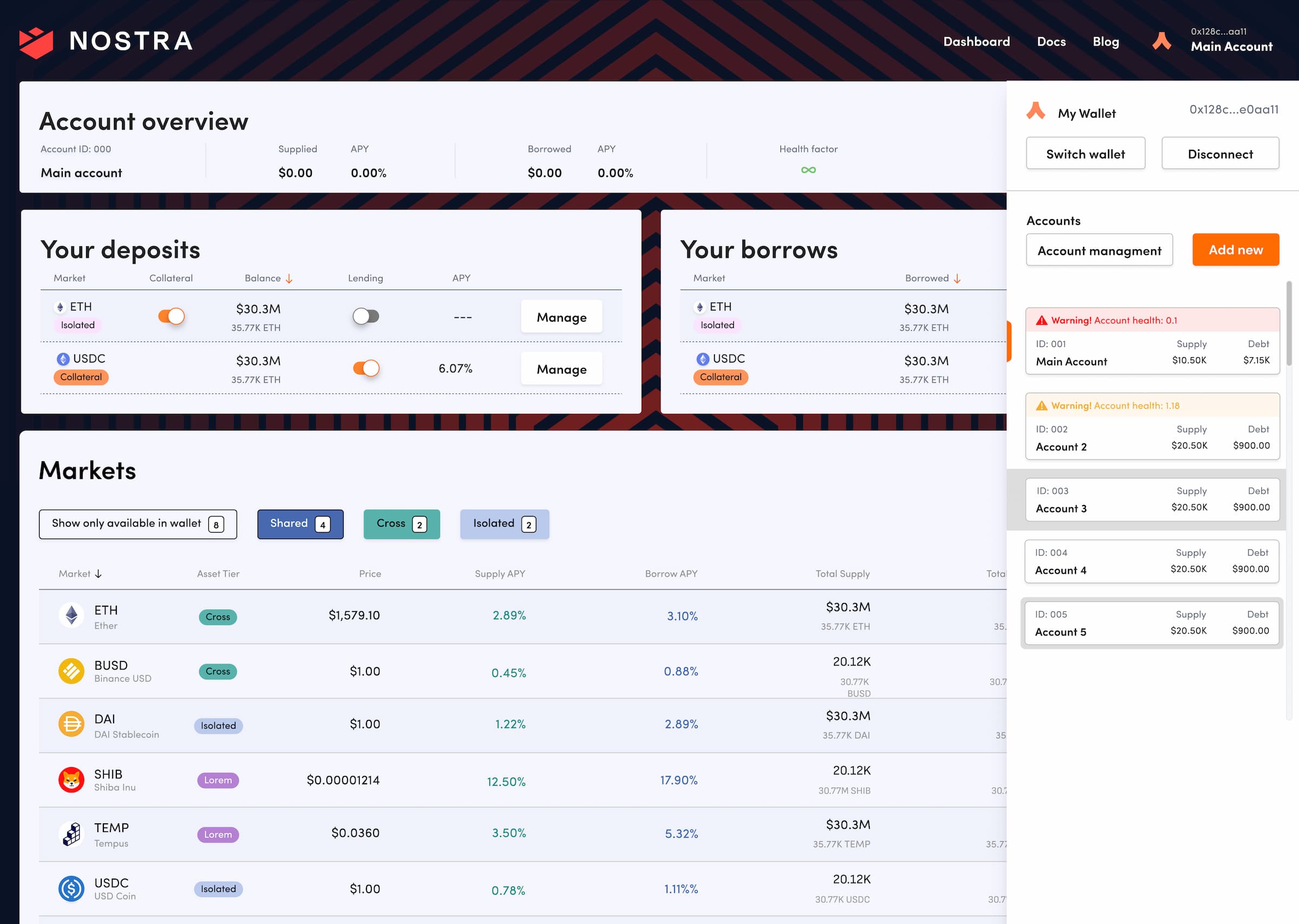
Exchange dashboard
Problem
Innovation reigns and conventional paths are yet to be paved in Web3. We encountered variety of challenges when designing for niche-specific product. Many of the components and interactions lack predefined patterns, unlike other sectors that have already established themselves. Designing from scratch demanded a lot of creativity and adaptability. Then again, that made problem-solving quite fun.
Ensuring a seamless and intuitive UX for very demanding community.
Building innovative solutions that stand out in the market. Meanwhile balancing creativity with practicality and user needs.
Iterating on designs based on usability and feedback.
Wenwin
The Wenwin Lottery is a next-generation lottery game built on Polygon that utilizes blockchain technology to provide a new level of transparency, security, convenience, and efficiency.
Decentralized lotteries seem fun, but bring new challenges to UX. It was a challenge to deliver engaging user experiences and gamification at the highest level, without compromising UI/UX.
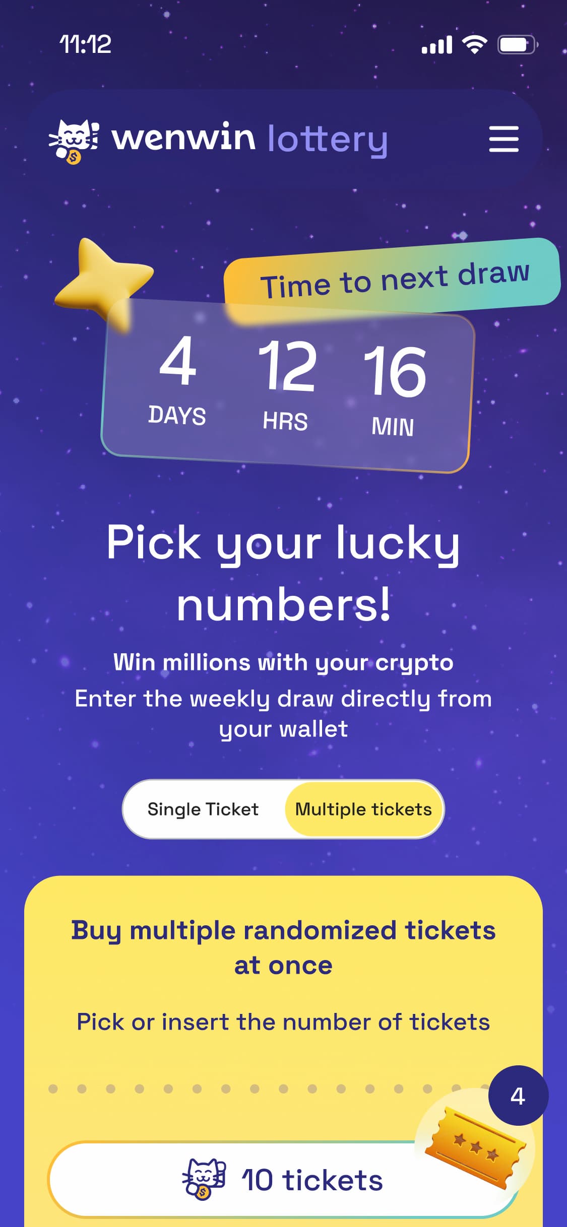
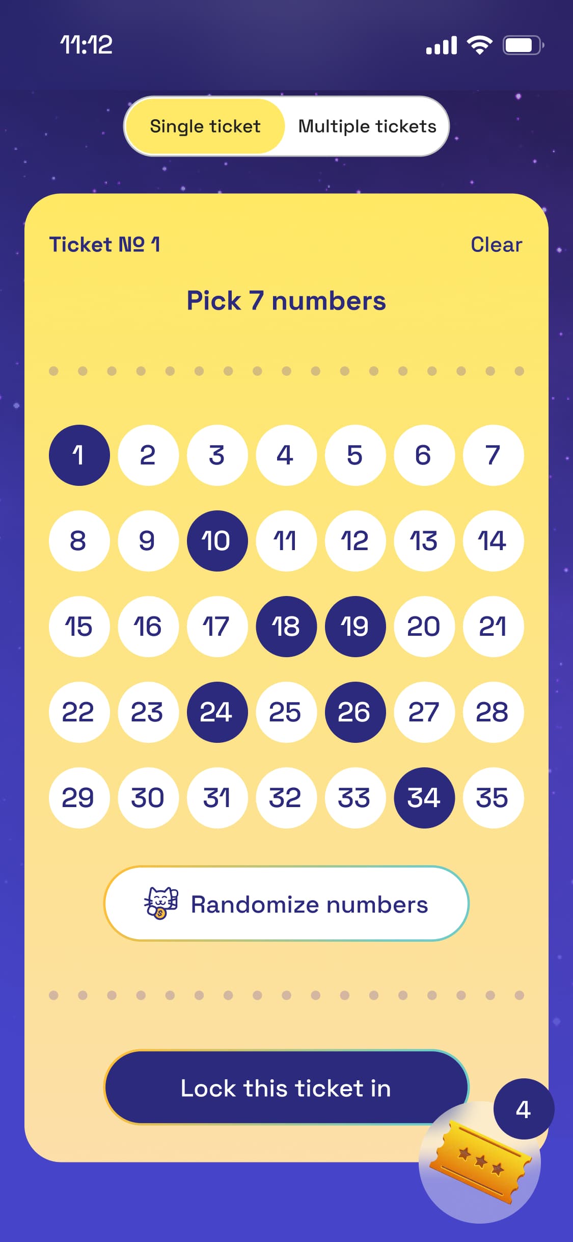
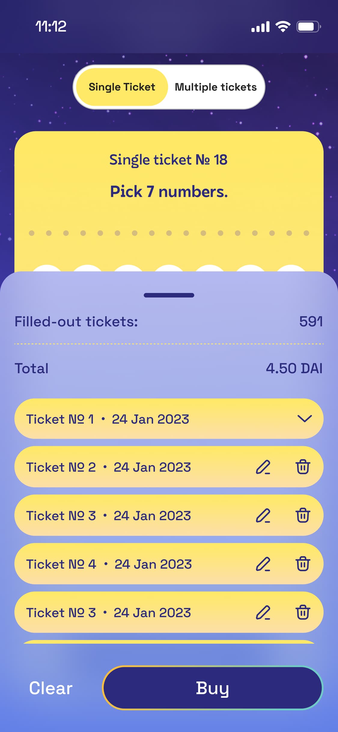
Wenwin mobile views
The design aimed to create a frictionless user journey. Creating this experience involved addressing fundamental challenges, such as onboarding new players through digital wallet integration, that would allow direct participation. The goal wasn't just to have a lottery but to change how decentralized gaming works. Now, anyone, anywhere, can take part, win, and enjoy an unstoppable lottery experience.
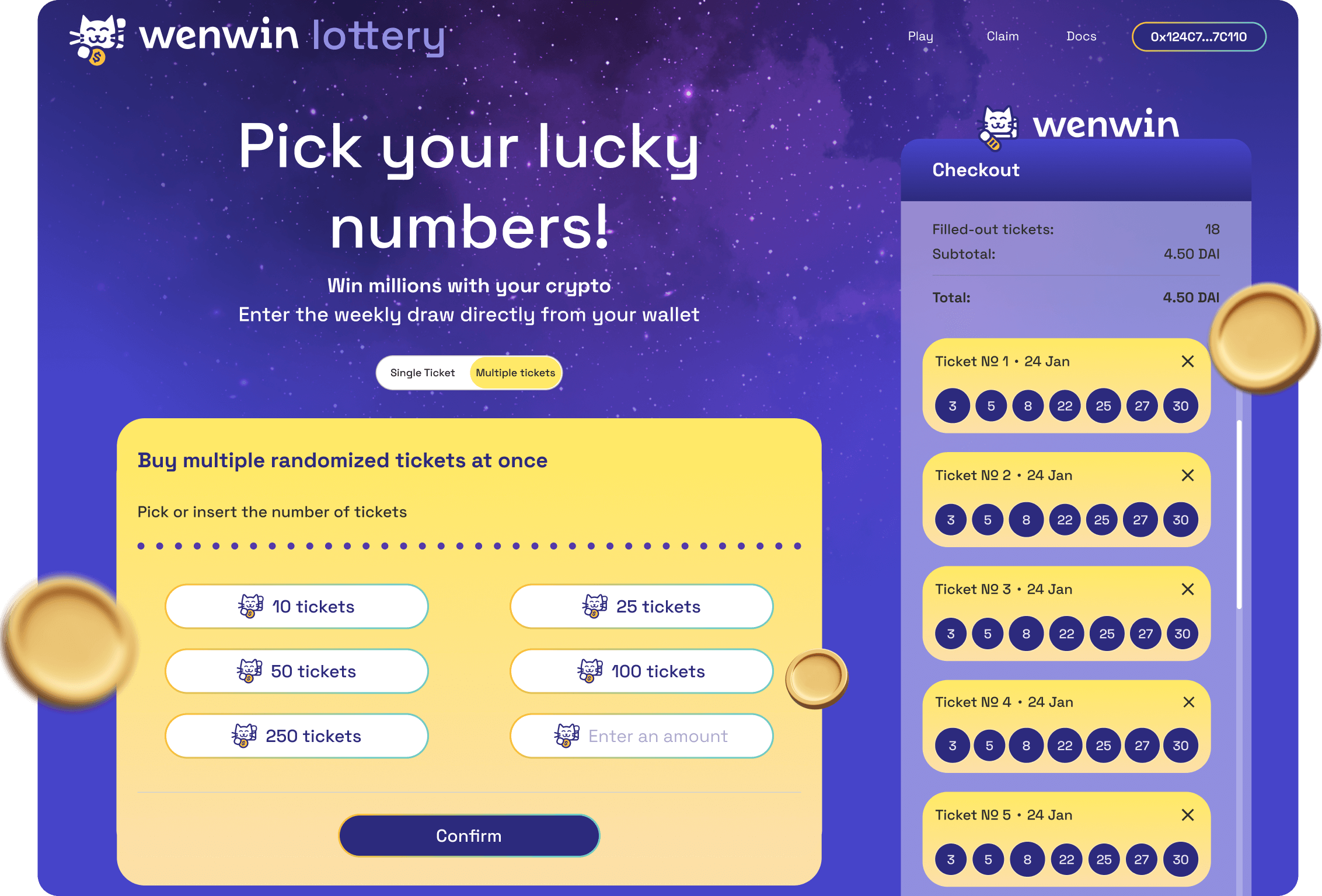
Wenwin desktop views
Problem
Challenge of simplifying the onboarding process for new players.
Designing an interface that effectively communicates the decentralized nature of the lottery, showcasing transparency in the draw process and winnings to build trust among users.
Striking the right balance in gamification to enhance user engagement without overwhelming the players.
Ensuring a consistent and user-friendly experience across various screens and devices, to satisfy a diverse user base.
Raft
Raft allows to deposit collateral or stablecoins to generate a stablecoin called R, which will earn APR for its holders. Raft is currently going through the process of reconstruction.
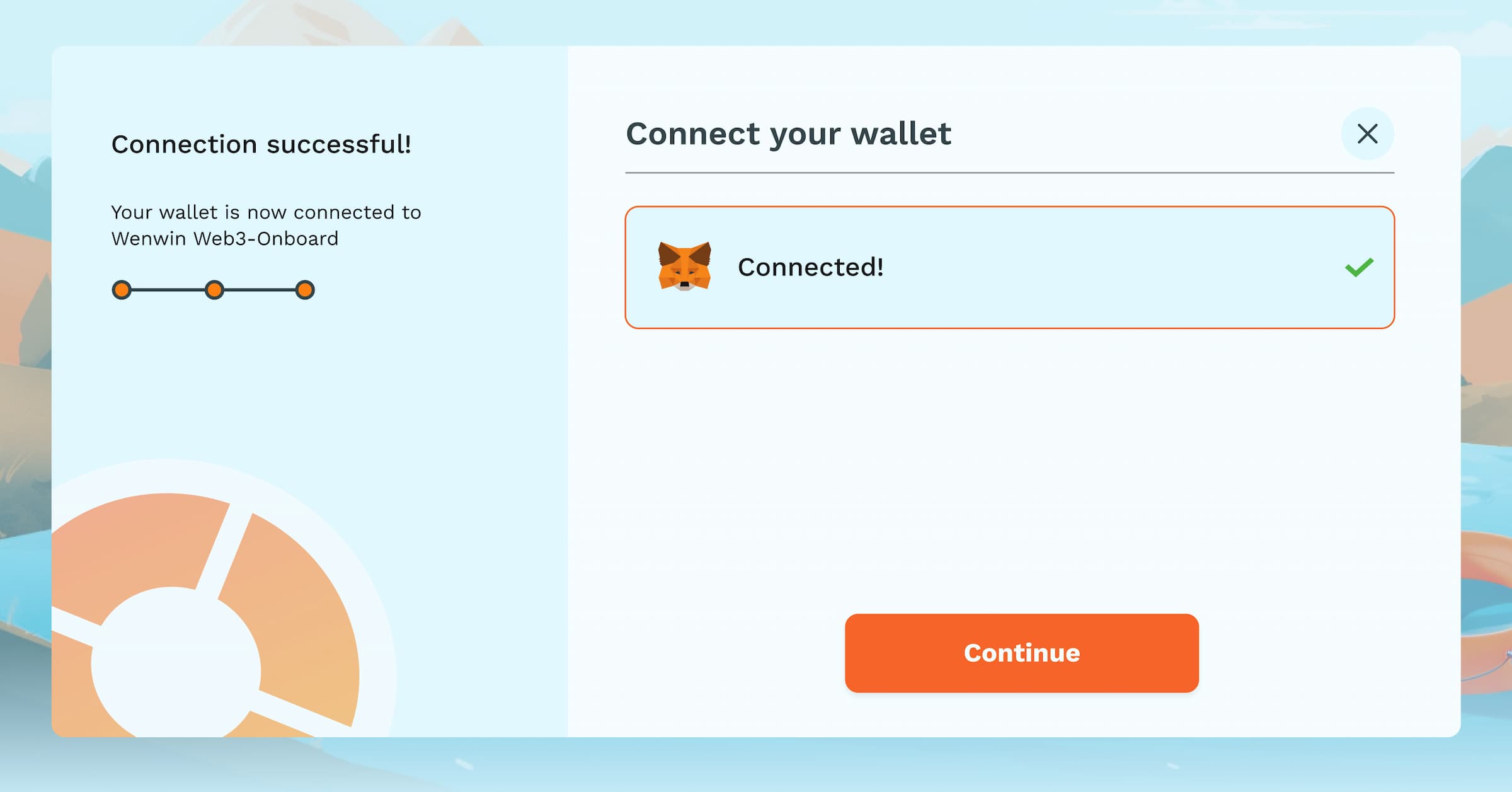
Raft wallet connect
As a product designer, I encountered similar challenges with Raft akin to those faced with Nostra. Raft is also a financial tool embedded with innovative features and niche-related patterns. The project, although familiar in essence, held fresh challenges for the creativity and adaptability, making the process both demanding and rewarding.
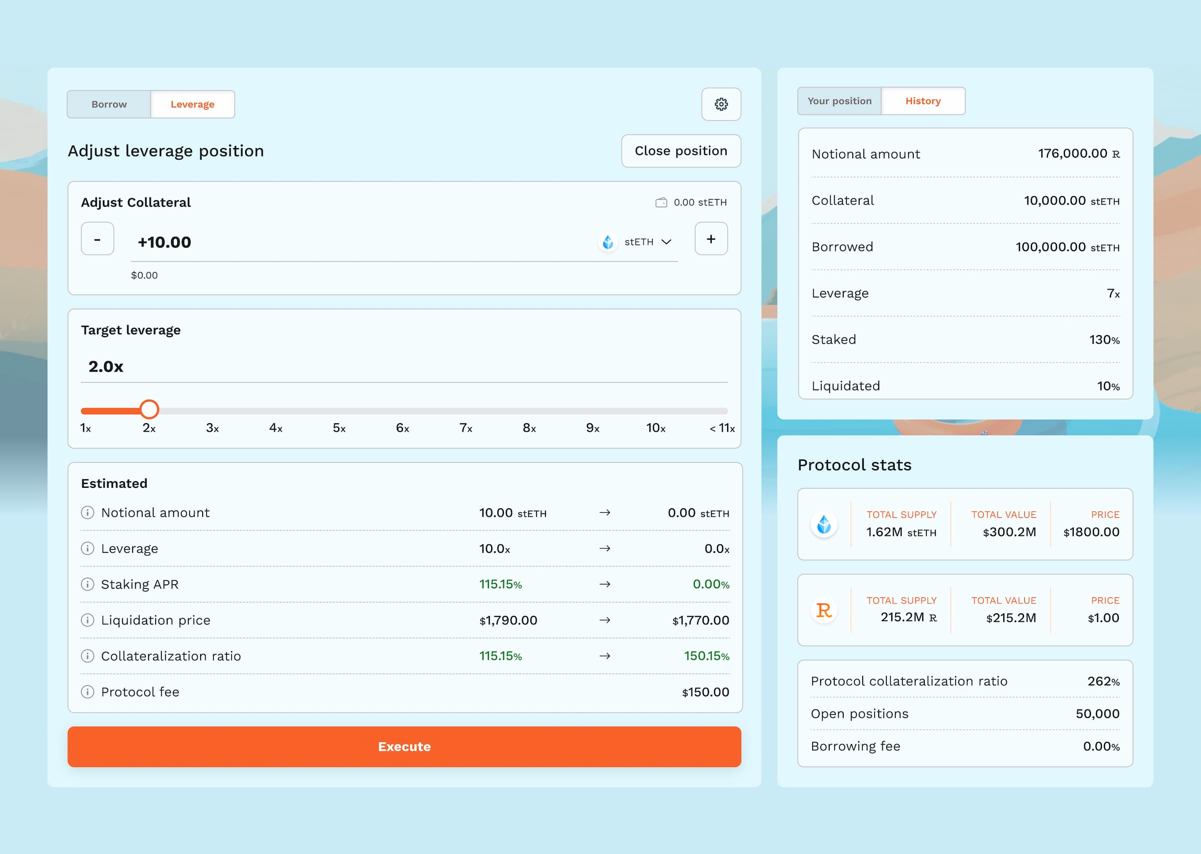
Raft dashboard
Challenges
Each project presented unique challenges. Designing in uncharted Web3 demanded an innovative approach to design thinking and redefine the essence of decentralized finance. Balancing sophistication and user-friendliness became most important, ensuring a seamless experience for various personas.
Lessons learned
Adapting to the demands of Web3 projects and their users, the complexity of decentralized platforms revealed the importance of understanding nuanced financial interactions and creating frictionless user journeys.
Navigating through the Web3 landscape taught valuable lessons in filtering and integrating features, demonstrating the need for a versatile approach in creating holistic, user-centric designs.
Meeting the diverse needs of users in Web3 financial tools highlighted the significance of recognizing and exceeding high standards, ensuring user engagement and satisfaction.