


Written in 2024
I joined the company in the middle of 2023 as a Lead Product Designer.
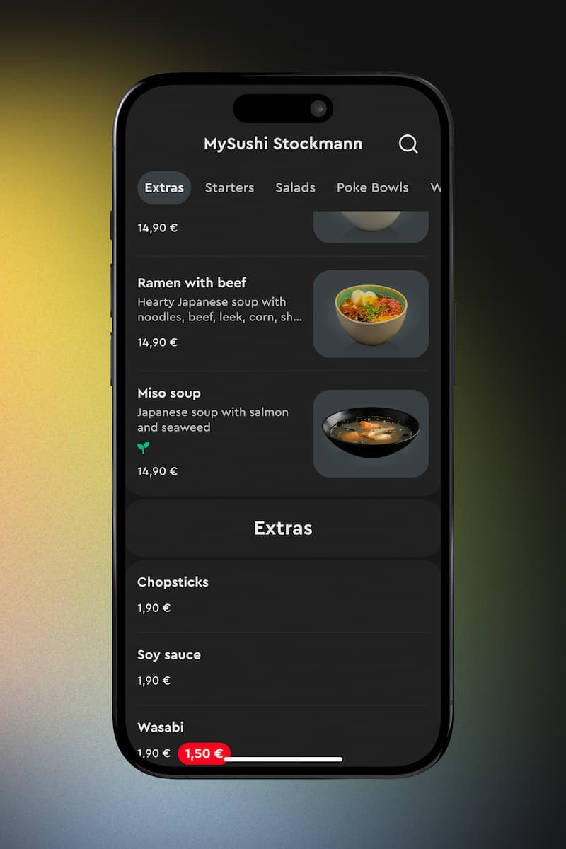
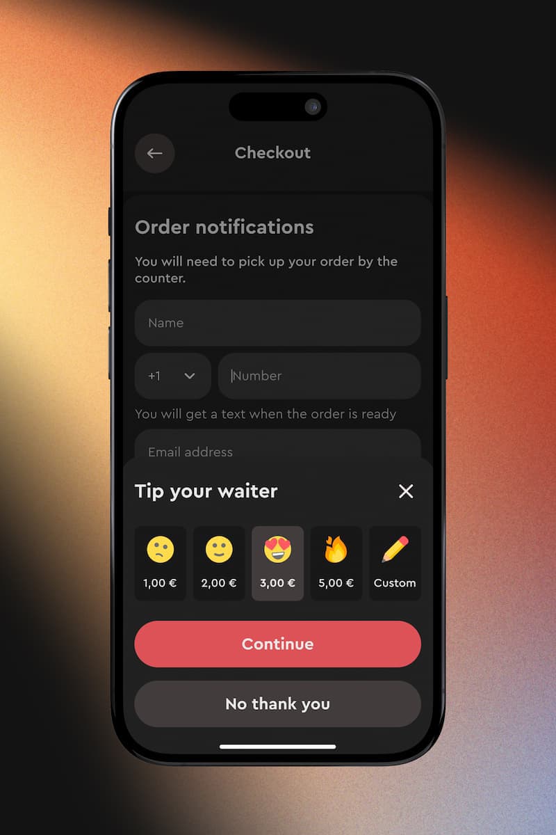
At the time Fudy was about to transition from a food delivery service to a hospitality sales and marketing platform. Within 10 months we created a QR-ordering product for restaurants, bars and other venues. With Order & Pay, we focused on creating an immediate, personal in-person dining experience.
I built the foundation for a component library with design tokens, making it easier to create a flexible white-label product. I designed web apps for both customers and kitchens. I also created unique QR code sticker templates in Figma.
In this case study I'll discuss how and why I created a design system. I will explain the reason for this project, the problems before and future, the design principles, methodologies and tools I used.
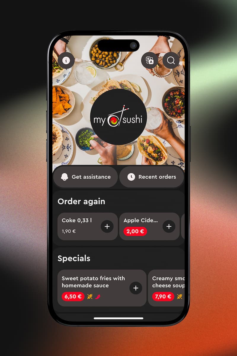
Order & Pay
Like many early-stage startups prioritizing speed over structure, Fudy's existing design system was hastily created during rapid product development cycles.
The challenge was further complicated by maintaining separate codebases for native iOS, Android, and Web applications. Component library, or a design system, should serve as a single source of truth, that makes product development more efficient. Instead, it slowed us down.
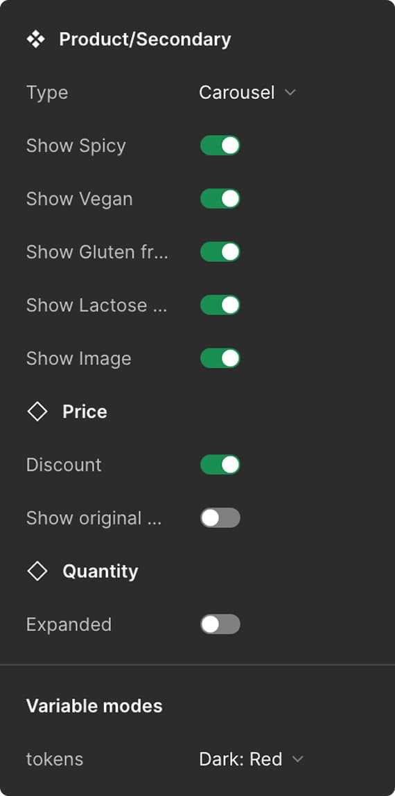
Component properties
We quickly realized that rebuilding would be more efficient than salvaging the existing component library. The primary catalyst for this initiative was the launch of Figma's Variables, which provided the technical foundation we needed.
Figma Variables are the representation of design tokens. Naturally, we wanted to achieve a common shared language across our codebase. Variables allowed us to create the multi-layered token structure that was essential for our white-label platform.
Previous Figma-facing design system used Styles to define color, typography and styles, which don't translate well into code. First thing was to migrate all Styles to Variables.
I created a collection for base color (or primitives) variables and migrated all the color values from the Styles to variables. Each color was organized into subcollections and were expanded into color ramps based on Material Design.
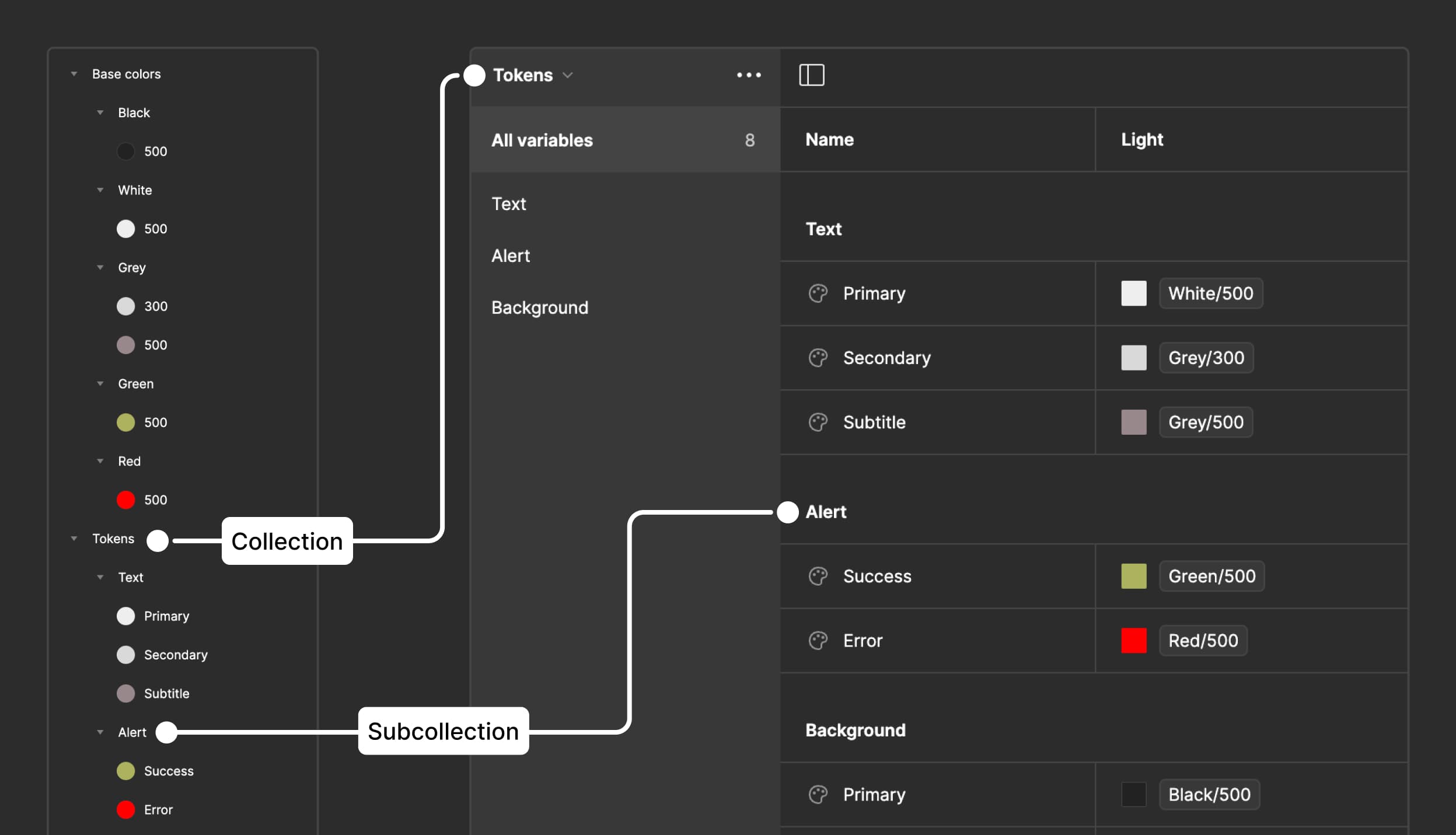
Migration from Styles to Variables
Next step was to create semantic (or alias) variables, named them by their actual purpose, to show how and where the variables are used. I identified in which areas the colors will be used and grouped the tokens by their matching purpose: surfaces, buttons, texts, icons, cards, labels, forms, alerts, etc. Within each group, I further grouped tokens by their exact usage, for example:
primary-button-surface,
primary-button-text and
primary-button-icon
It was difficult to overcome the desire to remain minimalist, but it turned out that it’s wiser to have rather more tokens than less - it will help the design system be more flexible in the future and offer more detailed theming.
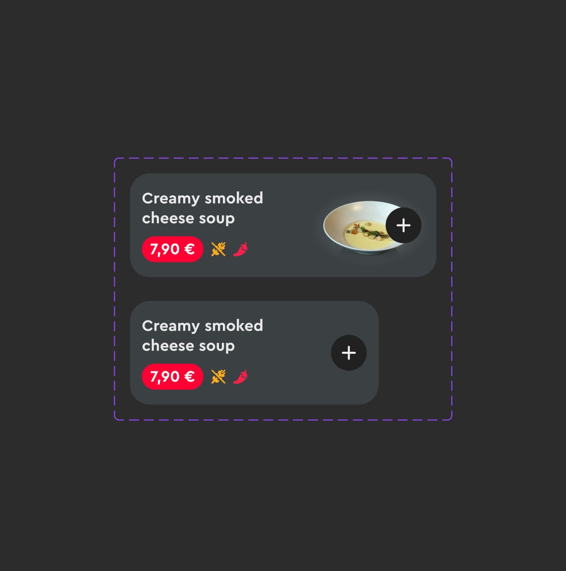
I adopted Atomic Design principles, that divides UI into small, reusable and flexible components. On the atomic level, I defined text styles, icons and elevations. Atoms were combined into molecules. Multiple molecules put together formed an Organism.
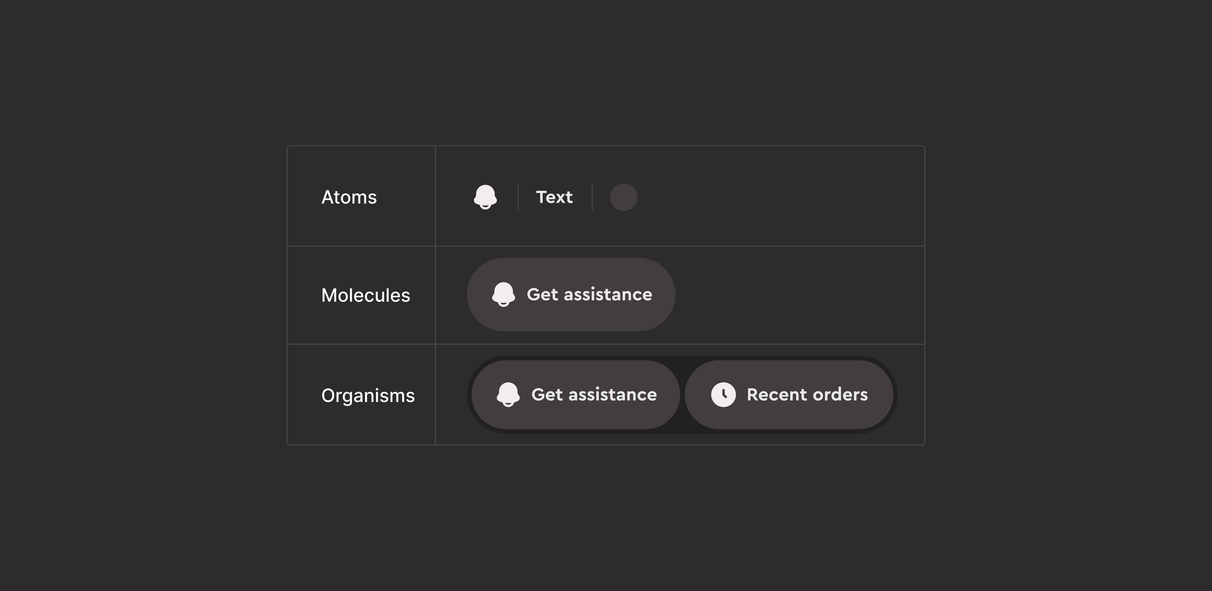
Atomic component
I defined text styles, icons and elevations as atoms. Atoms were then combined into molecules through nested instances. a button molecule contains text and icon atoms. Multiple molecules make an organism. For instance, two buttons nested within an auto-layout container form an organism.
It's easier to reuse components this way while keeping the interface consistent. Additionally, all team members share a common vocabulary and understand how different elements are constructed.
Modular design, furthermore, breaks down design into smaller parts. Each module serves a specific function or displays specific content. These modules can be combined and reused across the UI.
Meanwhile most of the modules contain nested instances (molecules, atoms), which can be swapped out, giving the design system even more flexibility. It makes components easier to maintain, debug and scale.
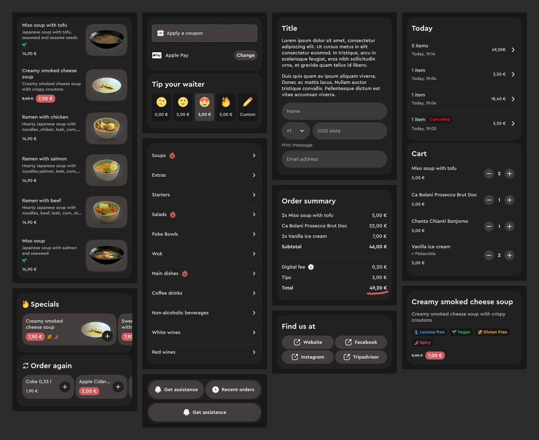
Modules
Variables and tokens allowed us to create modes (or themes) on a whim. This also aligned with the business goals, by giving our business clients chance to keep their brand’s face.
Some business users prefer light mode, some prefer dark mode. That might depend on the environment they work in. Some businesses have a strong brand and they want to keep that experience, when end user are using our product at the location of the business.
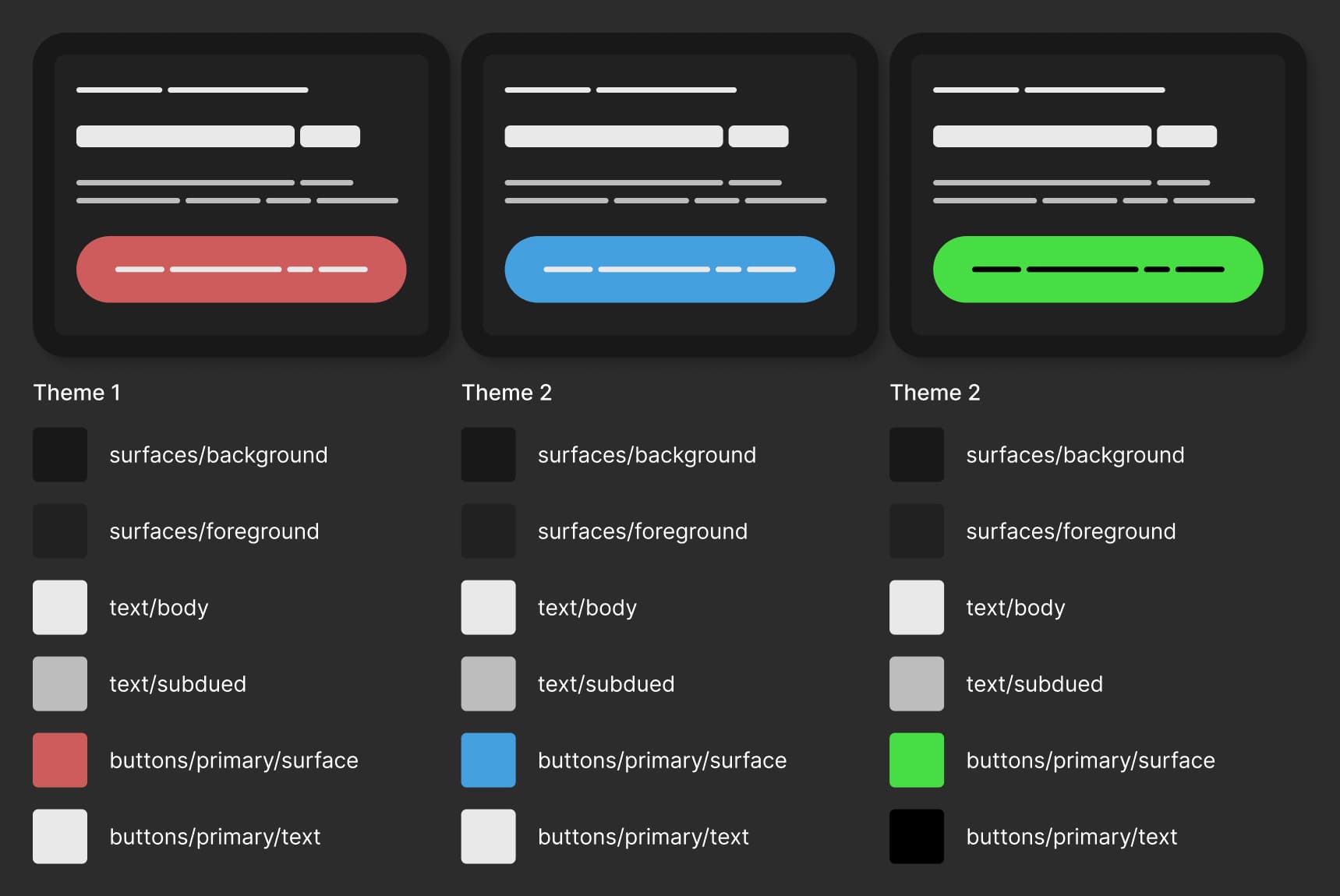
Theming with variable modes
New design system is set up following the best design practises, while also using Figma's latest features, like auto-layout, variables, variable modes and advanced prototyping. This will allow product team to rely on this system and trust it as a single source of truth. Overall it will make entire product development more efficient and transparent.
I recently came upon an article by Josh Clark, "Ship Faster by Building Design Systems Slower", who introduced me to the principle of Pace Layers, which states that successful design systems move more slowly than the products they support. Product is a fast layer, which innovates and Design System is a slow layer, which stabilizes. When that design system is poorly developed, it will slow the product layer.
I find myself really resonating with this statement and I've experienced first-hand, what will happen with the design system and the product itself, when the design system is rushed.
The timing of this project has been perfect for me, since I got to learn new software features while I was building a design system. I collaborated with developers, took into account their perspectives and hopes and I believe the result is something to be proud of.